Step by Step

1 | 2 | 3 | 4 | 5 | 6 | 7

We´re cutting the selected area of the image of Jessica and adding it to our wall:

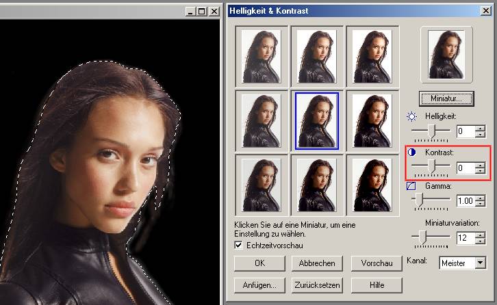
As you see, color and edges don´t fit to our wall yet. So we´re using the contrast and color settings of our program, to reduce the brightness and bring more contrast to our image. Here´s the example of photoimpact:

created by Ben Hassad version 4.0 impressum

You can set brightness, gamma and, in this case the more important thing, contrast of your selected object (sorry that the shot is in german, but you should understand it anyway). Another usefull tool is the ‘vignette’ tool. It automaticaly smoothes the edges of an object.

After setting the contrast to 24 (maybe you have to experiment with your own program a bit) and the vignette to 10, the wall takes another step to it´s finish.

< back

next >

Disclaimer: BenHassad.de is not responsible for any content on pages linked from that site through direct links and banners.